1. Changelog
  2. Introducing Gridx Ui Library

Ask AI

Ask about Classgrid, Classgrid features, pricing, demos, or support.

Classgrid logoClassgrid
  • Home
  • Pricing
  • About Us
  • Blog
Changelog

Quick Links

  • Contact Us
  • Integrations
  • Community ForumNEW
  • Our Team
  • Acknowledgements
  • Compare
  • Careers
  • Brand AssetsNEW

Resources

  • Case Studies
  • FAQ
  • Support
  • Help Center
  • Book a Demo
  • Reviews
  • DocsNEW

Get In Touch

Akurdi Railway Station Road, Sector No. 26, Pradhikaran, Nigdi, Pimpri-Chinchwad, Maharashtra 411044
+91 8623947038+91 8149277038support@classgrid.innikhil.shinde@classgrid.in

Social Presence

We make it easy to connect with us on every platform.

© 2026 Classgrid. All rights reserved.
Privacy|Terms|Security|Cookies|Disclaimer|IP Protection|Sitemap
major outage
Update / Announcement

Introducing GridX: Classgrid's Official UI Component Library

Version v0.1.5

August 17, 2026

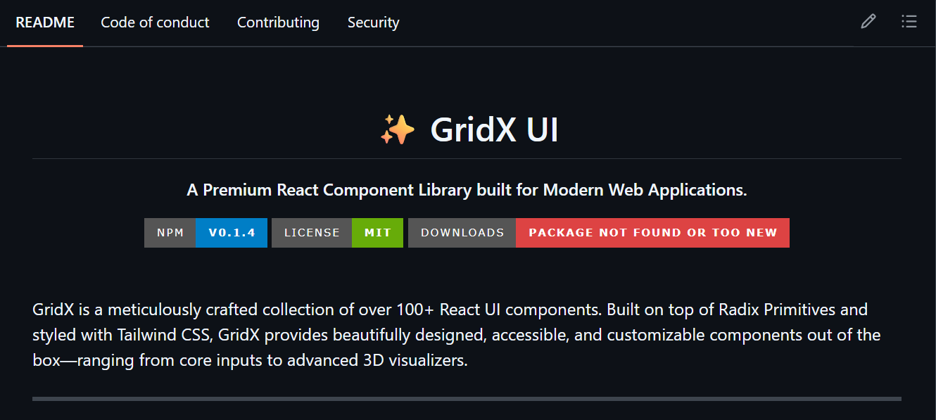
We're thrilled to announce the official release of GridX (@classgrid/gridx). Our proprietary, fully decoupled React UI library is now live on NPM, featuring 100+ beautifully designed components, micro-animations, and strict TypeScript types.

Today, we are thrilled to announce a major leap forward in our frontend engineering architecture: the official release of GridX (@classgrid/gridx).
Classgrid GridX Component LibraryGridX UI

As our ecosystem continues to grow, maintaining a cohesive design system by manually copying and pasting component files was no longer a scalable solution. We needed a centralized, enterprise-grade architecture. So, we built one from the ground up.

GridX is our proprietary, fully decoupled, standalone React UI library, now published directly to the NPM registry. It encapsulates our entire design language, leveraging modern Radix primitives, gorgeous micro-animations, and strict TypeScript definitions.

What does this mean for our development speed?

  • Instant Cross-Project Consistency: A button in one app now looks and behaves exactly like a button in another.
  • Zero Configuration: No more messy local component folders. Just install and import.

️ Getting Started

Using GridX is as simple as installing any standard React package. In your terminal, run:

SH
npm install @classgrid/gridx

Because GridX is pre-compiled, your repository stays perfectly clean. You can import any of our 100+ highly-styled components directly:

TSX
import { Button, ImageCropperModal } from "@classgrid/gridx";

export default function ProfileUpload() {
  return (
    <div className="p-8">
      <Button variant="default">Open Cropper</Button>
      <ImageCropperModal isOpen={true} />
    </div>
  );
}

Next step

See it in action

Book a demo to see how this update works in your institution's workflow.

Book a DemoView All Updates